
CASE STUDY
Strongbow Cider is one of the world’s leading cider making companies. This dry cider has been produced in the United Kingdom since the 1960’s, and has recently been purchased by Heineken in 2008 to help bring this orchard in a can to tables across the globe. In 2019, Strongbow’s 100 Cal Slim Cans won product of the year for their taste, refreshment and on-trend wellness focus.
With recent popularity of seltzers, such as White Claw, hitting the shelves in 2016 competition for a delicious and light refreshing drink has increased. This has caused many brands to launch their own version of seltzers and others to repackage their existing products to stand out on shelves.
The current problem that I have identified with Strongbow Ciders is that they do not stand out on liquor store shelves. As being a connoisseur of this brand, I am surprised by the response I get after recommending this product to a friend. Either they have never heard of it or have never seen it.
My key objective for redesigning the Strongbow 100 Cal Slim Cans is to match the company’s description of their ciders visually and to have it stand out on shelves to attract Millenials and Gen Z.
PROJECT SUMMARY
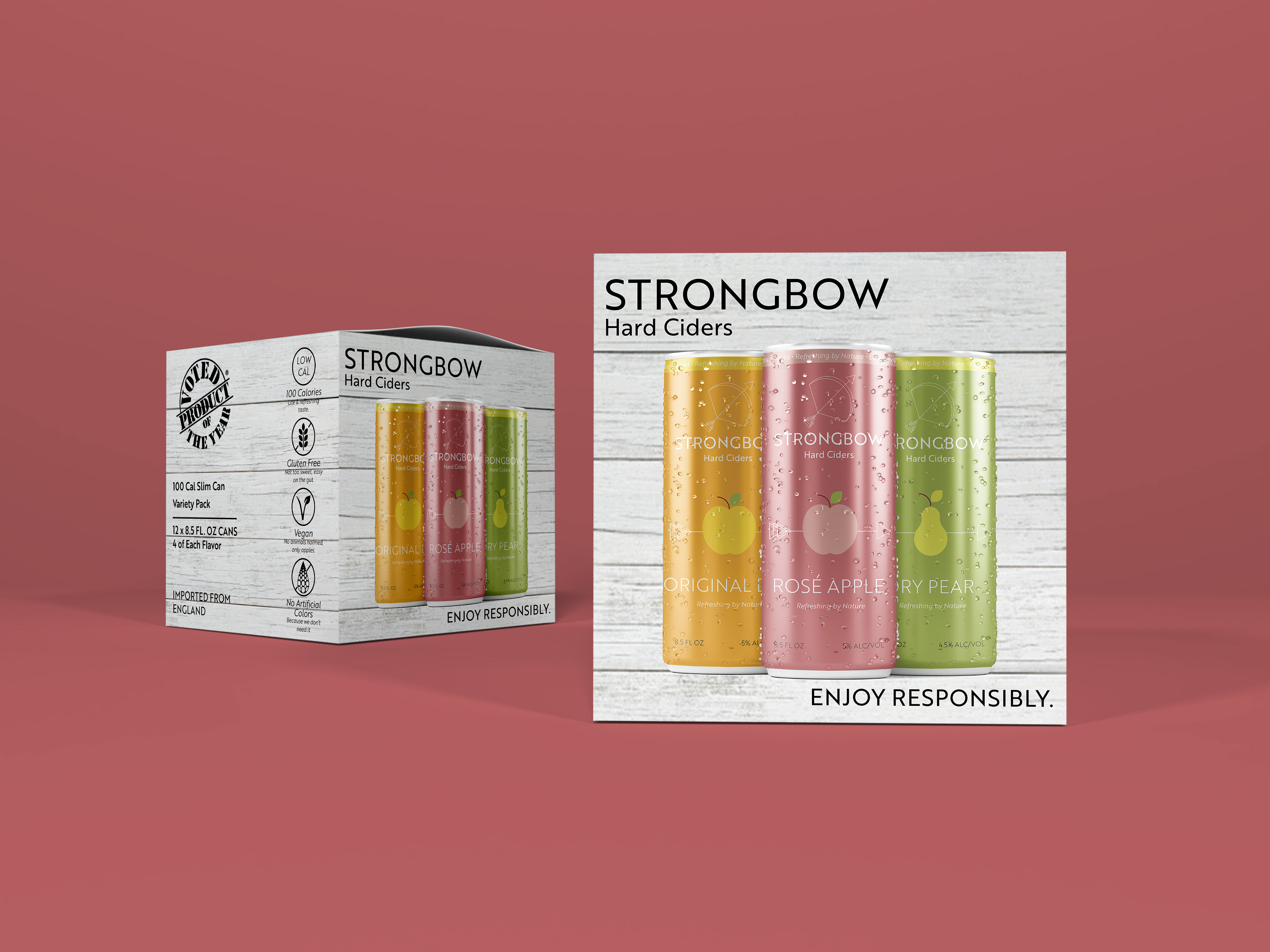
- Redesign Logo
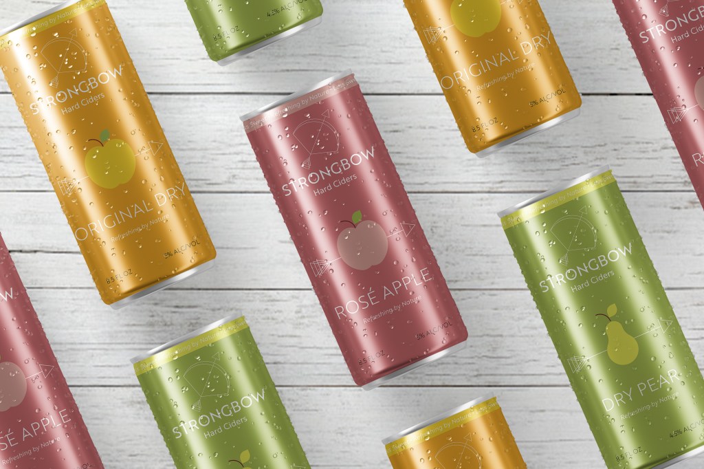
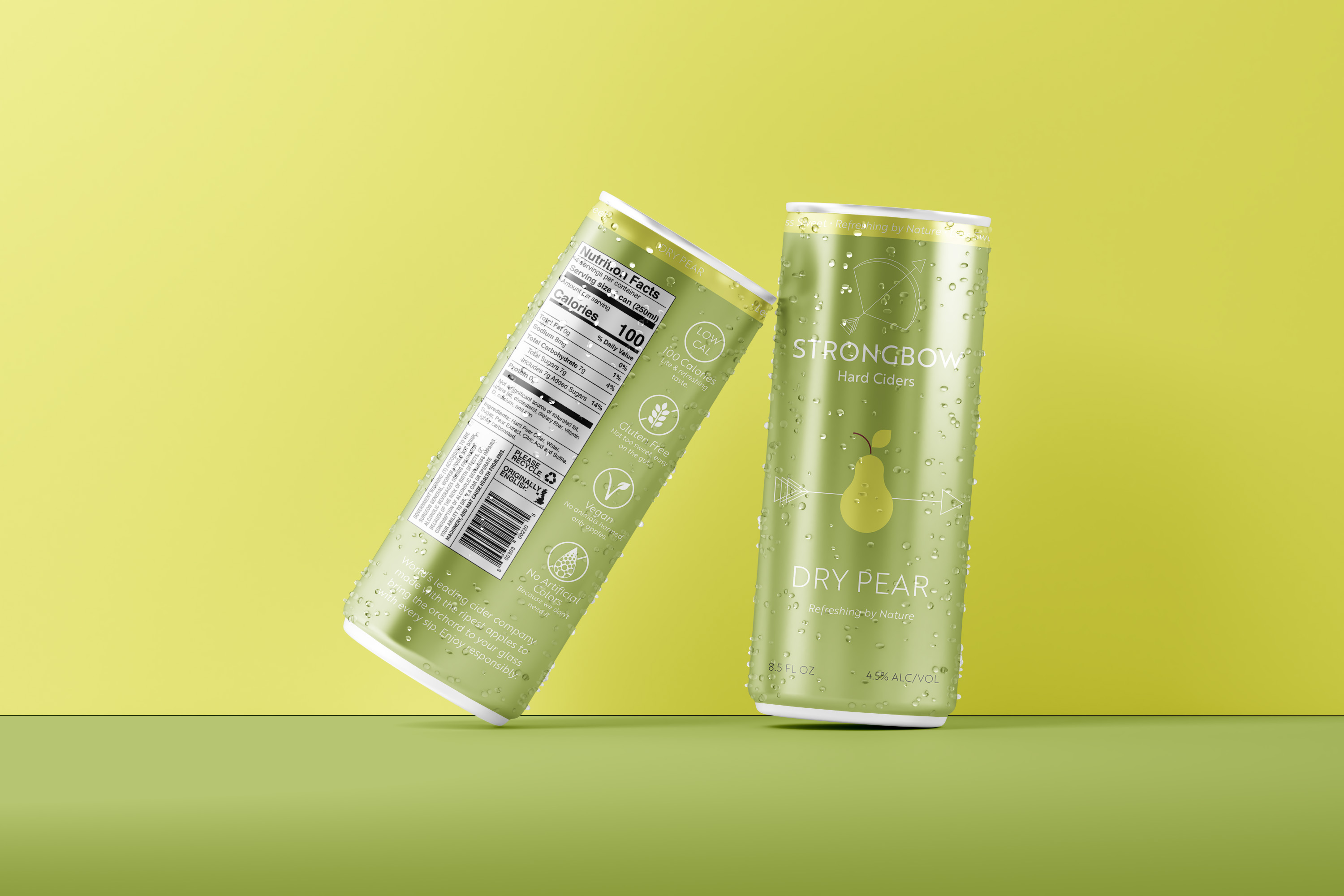
- Redesign Slim Can Pack:
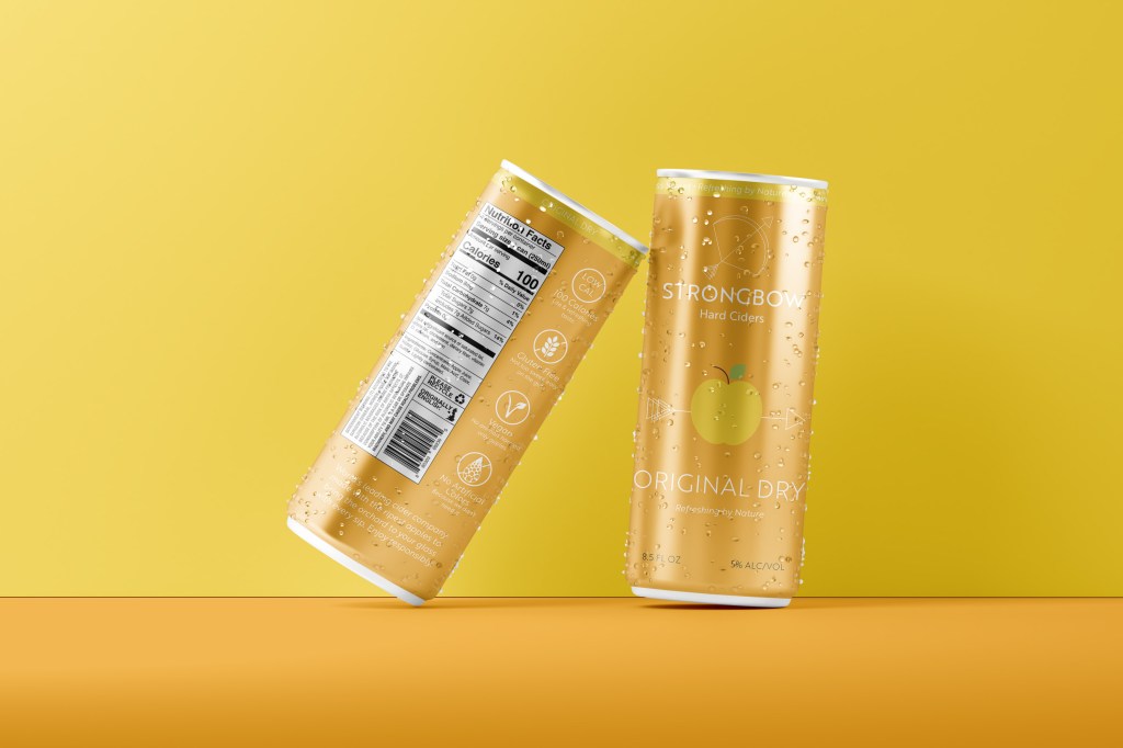
- Original Dry
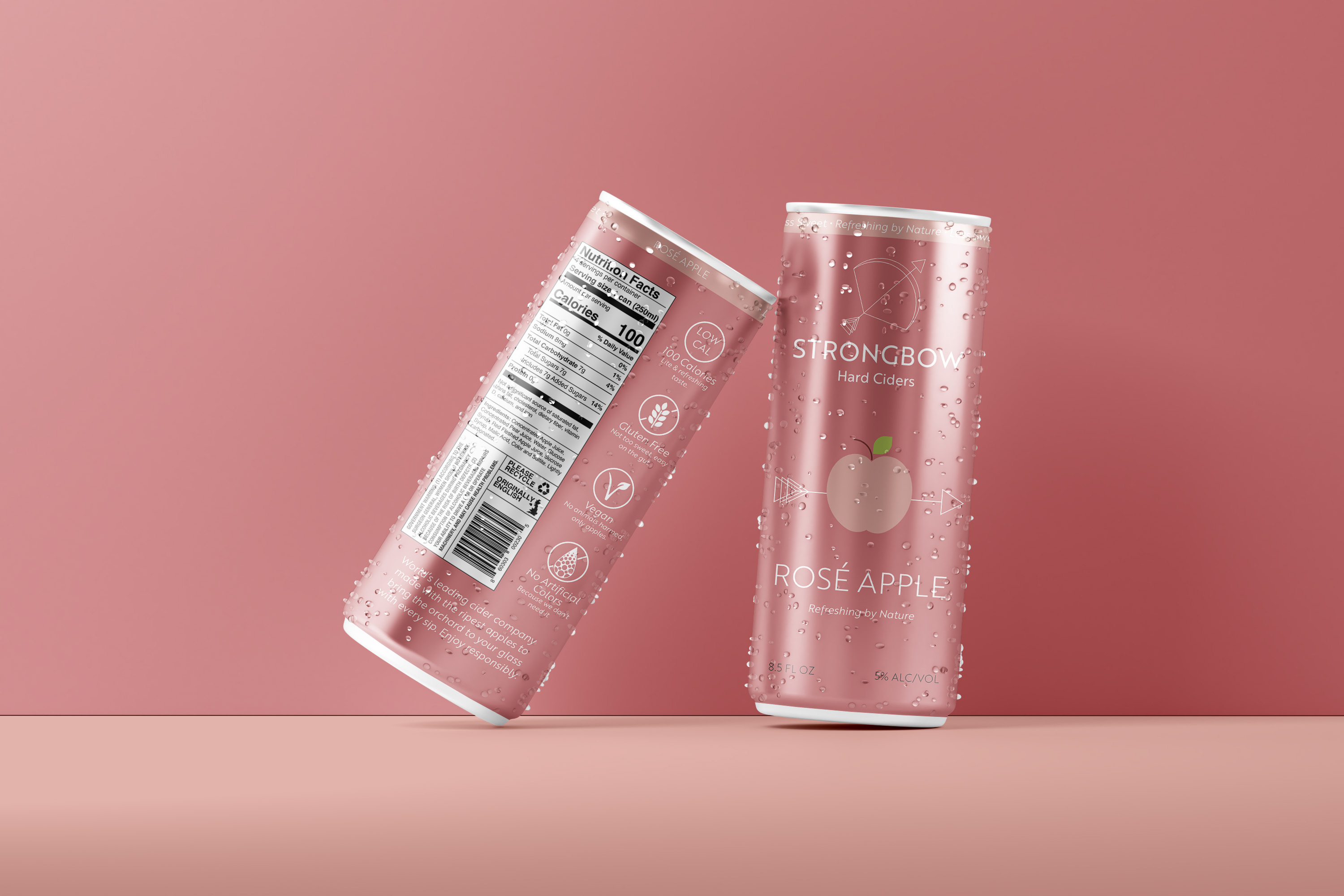
- Rosé Apple
- Dry Pear
- Redesign Box
RESEARCH
My design process starts with gathering information about the company and the product. Through my research I was able to learn about the countries history and missions. I pulled out keywords to help drive my design process: Refreshing by Nature, Crisp, Fresh, Cold, Clean, and Farm to Table.
My design process starts with gathering information about the company and the product. Through my research I was able to learn about the countries history and missions. I pulled out keywords to help drive my design process: Refreshing by Nature, Crisp, Fresh, Cold, Clean, and Farm to Table.
Next, I researched the companies past logos and packaging, along with their competitors. There’s a strong emphasis on archery with previous logos, not just the bow itself. Key competitors that I identified were: Blakes Cider, Downeast Cider, Angry Orchard, Somsberry and Crispin.
DESIGN PROCESS
Moving into Adobe Illustrator, I started a mood board of all the competitors to see what other cider brands look like on the shelves. This helped me identify key elements and colors used to visually describe cider.
Starting the illustration process, I knew I wanted to have the rebrand be clean and fresh. I wanted to have a minimalist design that could effectively describe those key words. I have a personal strength with geometric design so I played around with shapes and lines to create the bow and arrow. I sought out fonts that were geometric and clean for the typeface.
I used fruit and color to describe the taste and flavor of each can. I used symmetry to develop the fruit icons and played around with various shades of yellows, greens, and pinks that could give contrast.
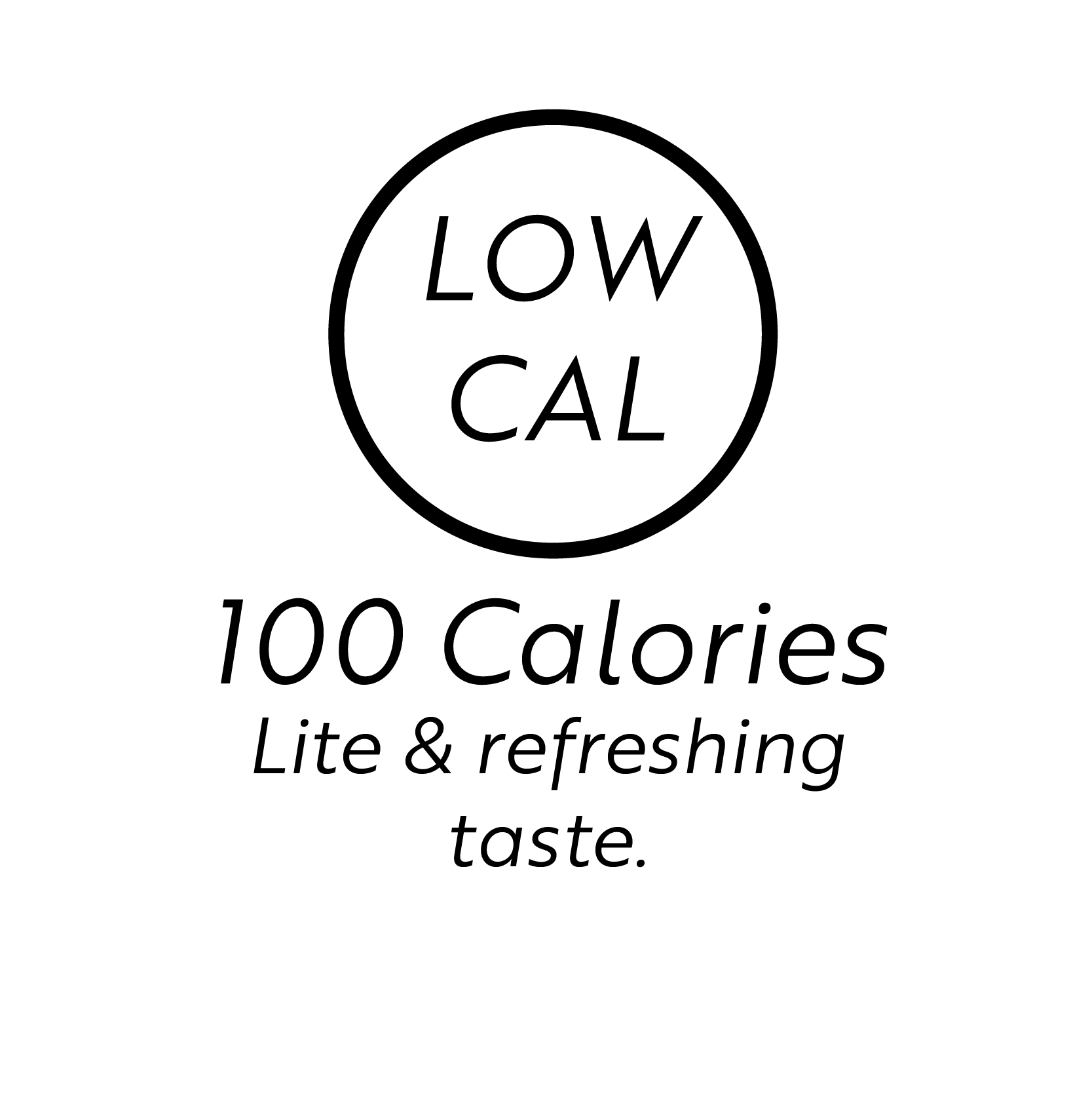
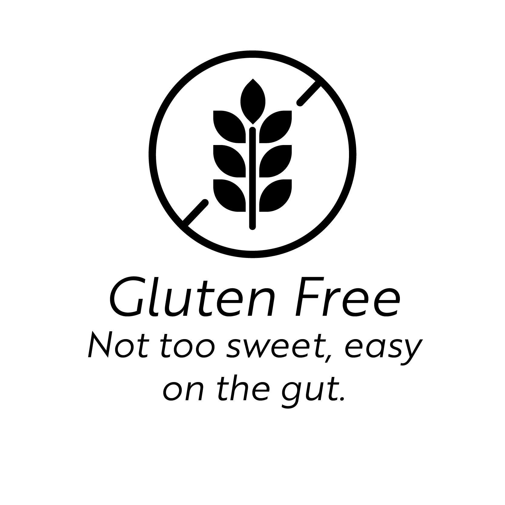
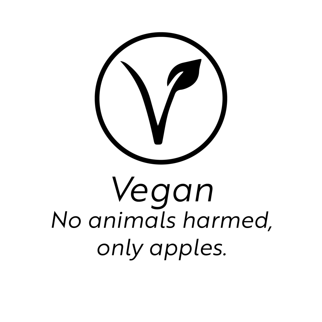
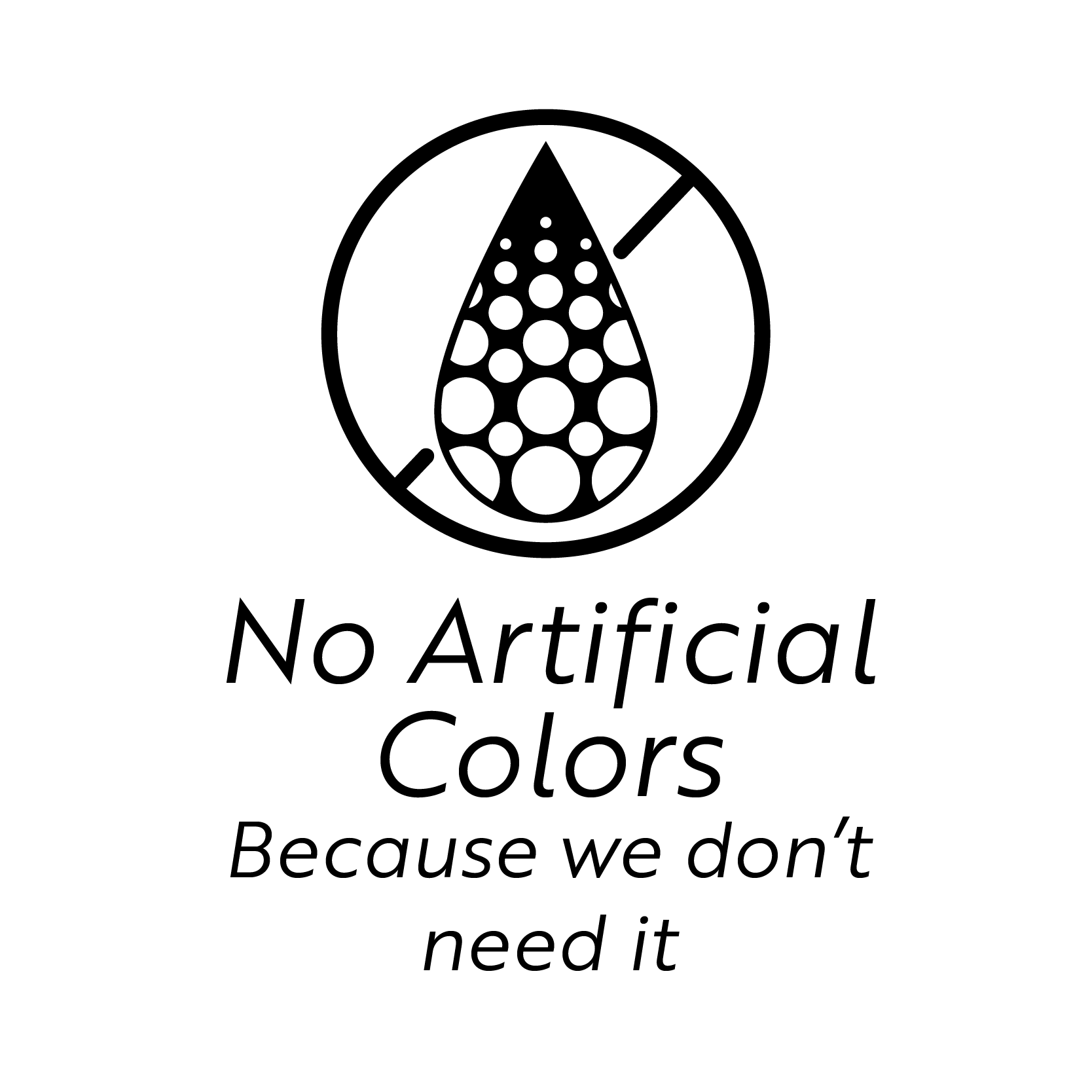
I researched each flavor further to develop the nutrition labels and identified key nutrition facts that not only described how fresh it was–but appealed to the target audience. Those facts were: Low Cal, Gluten Free, Vegan, and No Artificial Colors.
CONCLUSION
I believe that the redesign and repackaging that I created accomplished my project goals. I presented my designs and process to members of my target audience. I received an unanimous “Yes, I would buy that” compared to my previous “I’ve never seen that.”

Leave a comment